Case Study

Optimizing Product Pages Using Familiar User Behavior Patterns for Higher Engagement

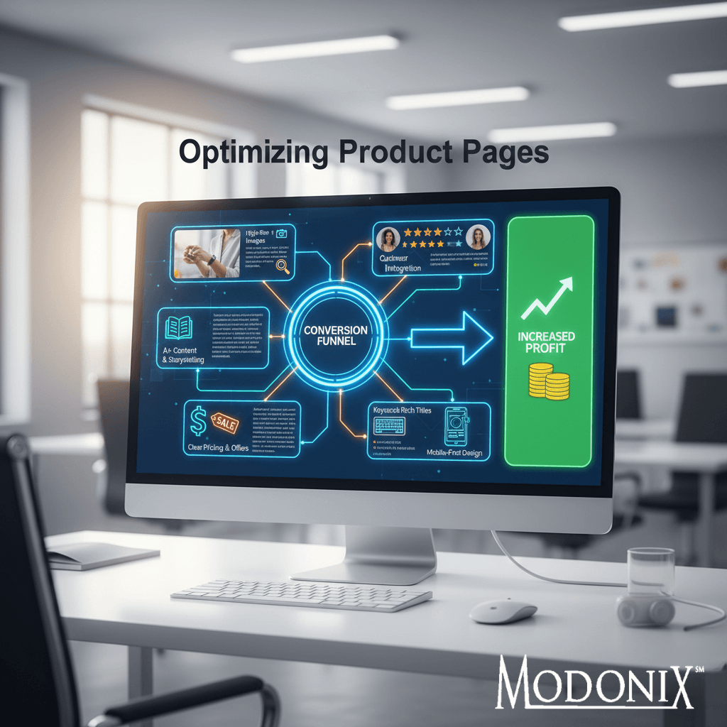
Modonix partnered with an e-commerce brand whose product pages were underperforming despite strong traffic. By redesigning the page structure to align with familiar user behavior patterns how shoppers naturally scan, compare, and evaluate products we transformed the customer journey end-to-end, increasing engagement and improving conversion quality.

Optimizing Product Pages

Overview

An e-commerce brand approached Modonix with a challenge: traffic was steady, but product page engagement was weak. Users weren’t scrolling, weren’t interacting with content, and weren’t converting at expected rates. Product pages felt “busy but unclear,” leaving customers unsure about what mattered or why the product was the right choice.

They needed a product page experience built around how users behave, not how teams assumed they behaved. That meant clarity, structure, predictability, and intuitive content flow that reduced cognitive load and guided the shopper toward action.

Modonix applied a system-first approach built on our Three Pillars: Performance, Insight, and Systems. Instead of adding more content or visuals, we rebuilt pages around familiar UX patterns patterns users already recognize from high-performing e-commerce sites. The result: pages that felt natural, trusted, and effortless to navigate.

The goal was simple: increase engagement and conversions by aligning every content and design decision with real-world user behavior.

Optimizing Product Pages

Challenges

The brand had strong products, but their product pages worked against them. During the audit, several friction points became clear:

  • Too much text crowded the top of the page
    • Key benefits buried in long paragraphs
    • Technical specs presented without context
    • Visual hierarchy inconsistent across SKUs
    • Comparison data missing, forcing users to search elsewhere
    • Scattered content flow that didn’t match how customers evaluate products
    • High bounce rates despite strong traffic sources

The result was predictable: customers felt unsure, overwhelmed, or confused decreasing engagement and hurting conversions.

Opportunity

The audit revealed several high-impact opportunities:

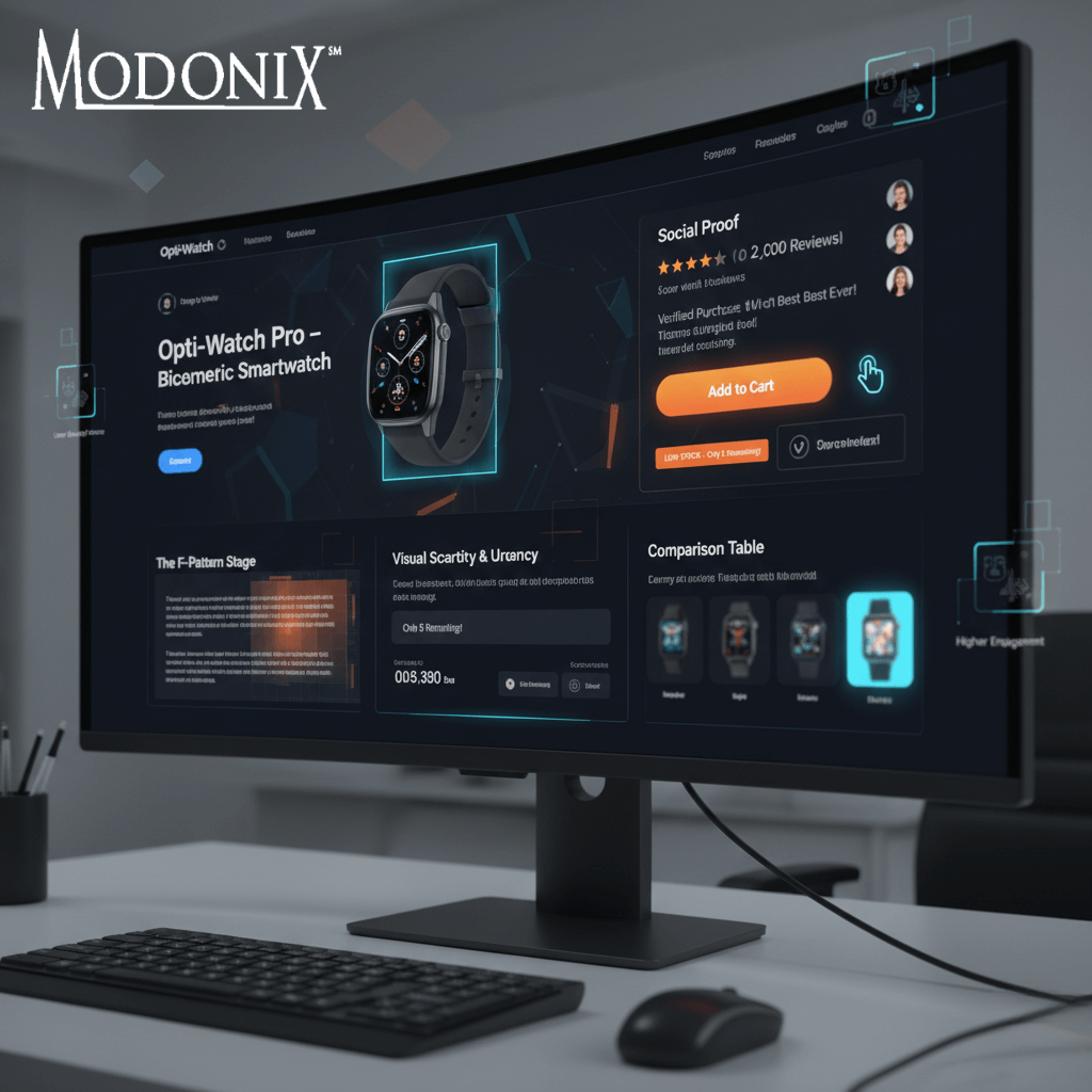
  • Users consistently scanned in predictable patterns (F-pattern, Z-pattern), but content     wasn’t structured to match them
    • Customers expected comparison charts but found none
    • Critical information (benefits, safety, warranty, materials) was scattered
    • Familiar UX layouts used by top retailers were missing
    • The brand lacked consistent page templates across SKUs, creating a fractured experience

Rather than needing new traffic, the real opportunity was rebuilding product pages to match user expectations and behavior, making them intuitive from the first second.

Strategy Overview

Modonix applied a system first approach designed to align product pages with proven user behavior patterns. The goal wasn’t to redesign visually  it was to redesign structurally.

The strategy focused on creating a predictable, frictionless experience across all pages using three pillars:

  • Familiar scanning patterns (F-pattern, Z-pattern)
  • Clear visual hierarchy
  • Content grouped by decision-making stages

With a standardized structure, consistent messaging, and UX patterns that shoppers instantly recognize, engagement increased naturally, and conversions became more efficient.

#key_pillar_point_heading_

#key_pillar_point_content

Execution

Execution focused on aligning every product page with how real shoppers think, read, and decide not on cosmetic design changes.

Page Structure Standardization

We rebuilt page layouts using familiar UX scanning patterns that improved clarity and guided the user journey.

Behavior-Based Content Blocks

We reorganized product benefits, features, specs, and FAQs into predictable, high-conversion sections that matched user habits.

Comparison & Decision Support Tools

We added or optimized charts, icons, and structured summaries to reduce cognitive load and speed up decision-making.

Unified Visual Framework

We have aligned image styles, sequence order, and visual cues to create a cohesive experience across all pages.
Optimizing Product Pages

Results

Within 45–60 days, the brand achieved measurable improvements in engagement and conversion entirely driven by UX restructuring and content alignment.

#metric

#result

+ 0 %

Within 45–60 days, the brand achieved measurable improvements in engagement and conversion entirely driven by UX restructuring and content alignment.

Key Takeaway

Optimizing product pages isn’t about adding more content, it’s about understanding how users behave and aligning the page to match. When product pages follow familiar patterns, customers feel confident, clarity increases, and conversions follow naturally.

Ready to Grow with Modonix?

Let’s turn your digital goals into measurable results. Whether you’re scaling an eCommerce brand or refining your online strategy, Modonix is here to help. Book a consultation and take the first step toward smarter, faster growth.

Wait! Book a free growth audit – it only takes 30 seconds.